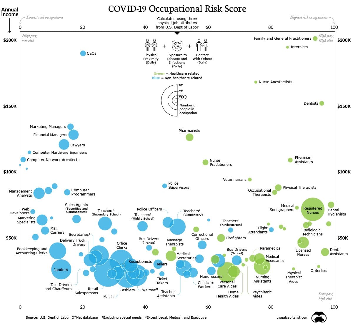
This infographic uses 3 main attributes from the U.S department of labor, to tell which professions are at higher risk of exposure to the virus. The 3 characteristics are: physical proximity on a daily basis, exposure to disease and infections (daily as well) and contact with others.
The graphic shows annual income (Y) vs. lowest to highest risk occupations (X). It shows where practitioners stand, almost in the right side corner, where are the CEO’s, pharmacists, computer programers, nurses, teachers, people that work in retail etc. The number 1 occupation that is at higher risk of contamination is not general practitioners but dentist and dental hygienists because according to the 3 attributes they have higher contact with others, a lot of physical proximity and high exposure to diseases. In contrast, economists for example are the lowest risk population.
“Individuals on the front lines, whether they’re taking care of patients or stocking grocery shelves, are placing themselves at risk to ensure our communities can continue to run smoothly. Meanwhile, those fortunate enough to work from home can help flatten the curve by continuing to practice safe social distancing, even on weekends.”

This graph interestingly shows the connection between risk level and occupations, which is innovative and intriguing to display a different perspective in this outbreak and gives people some reflection on our society.
I agree. I was impressed when I came across this graphic. Im glad it’s here.